Bloom
A mental wellness app grounded in real interviews including conversations with therapists designed to make asking for support feel less like a hurdle.
A mental wellness app grounded in real interviews including conversations with therapists designed to make asking for support feel less like a hurdle.
Bloom was a project assigned during a UX design course each student was given a different brief, and mine was mental wellness. Rather than treat that as a fixed spec, I took it as a real question: how do you lower the emotional barrier to seeking mental health support, when most people never get past the discomfort of asking for help in the first place?
Rather than guess at the problem, I conducted one-on-one interviews with people about their own experiences with mental health support, and visited Agatsu Center to interview practicing therapists directly about what actually helps someone follow through on care, and where digital tools tend to get in the way.
What came out of those conversations shaped the whole design: people don't want a clinical tool, they want something that feels like a companion. Bloom brings self-reflection, professional guidance, and everyday habits into one calm experience, with every screen built to reduce friction at the exact moments people are most likely to give up.
One small shift
Everything begins to change
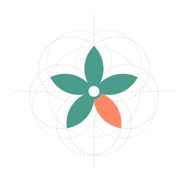
Bloom wasn't designed as a literal flower.
It was built from geometry, search and intention.
During the exploration, the structure revealed a story: four petals form a continuous rhythm, a familiar loop we often live in.
The fifth petal is the one that breaks it.
A subtle shift that represents the courage to choose a healthier direction.
At the heart of it all is you.
Every change begins from within.
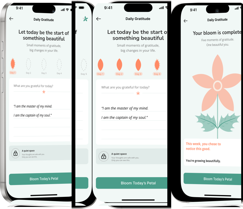
Most wellness apps default to cold blues and clinical whites safe, but forgettable, and exactly the tone that makes mental health support feel like a hospital form. Bloom goes the other way: sage and coral were chosen to make the app feel engaging and motivating, closer to something you'd actually want to open, with room for the small, playful moments like Daily Gratitude's blooming flower to feel fun instead of clinical.
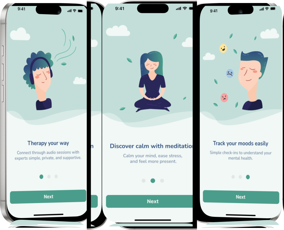
“I just don’t know what exactly to expect in terms of what is it that can be in an app.”
Leads with breadth (audio sessions, private, supportive) before asking for any commitment, directly answering this uncertainty.
“Meditation is something I would like to use… but it never really does [help in the moment].”
Positions meditation as one tool among several, not the whole app, so it doesn’t overpromise on a single feature.
“I want mood tracking on daily basis… it should not validate it.”
Frames mood tracking as a simple check-in, not a diagnostic tool, keeping the tone light before the deeper questionnaire.
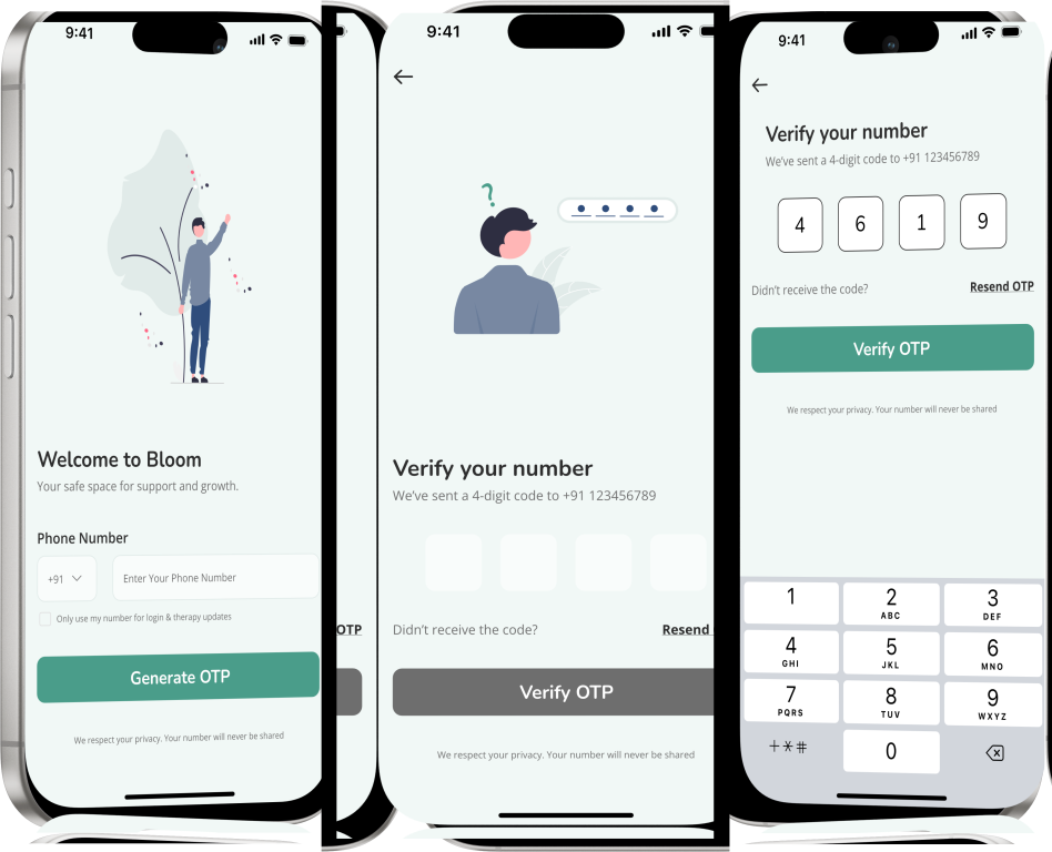
“Creating an account should feel like the beginning of support, not another task.”
Sets the tone before any form field appears, so signing up still feels like part of the calm experience rather than a hard switch into admin mode.
“Security should build confidence without interrupting the experience.”
A single, low-friction identity step keeps trust high without demanding excessive personal information up front.
“Simple interactions help users move forward with confidence.”
A familiar OTP pattern users already know from banking and messaging apps, reducing hesitation at the trickiest step of onboarding.
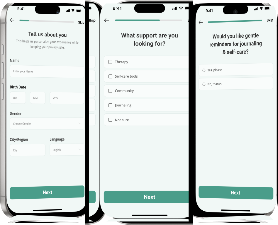
“I want the app to understand me, without asking too much.”
A short profile step personalizes the experience without feeling like an intake form for a clinical service.
“I want support that fits what I’m looking for, not a one-size-fits-all approach.”
Framing choices around support types, not diagnoses, keeps the tone approachable and non-clinical.
“I want support when I need it, not when it interrupts me.”
Closes the questionnaire on an encouraging note, transitioning smoothly into the main product experience.
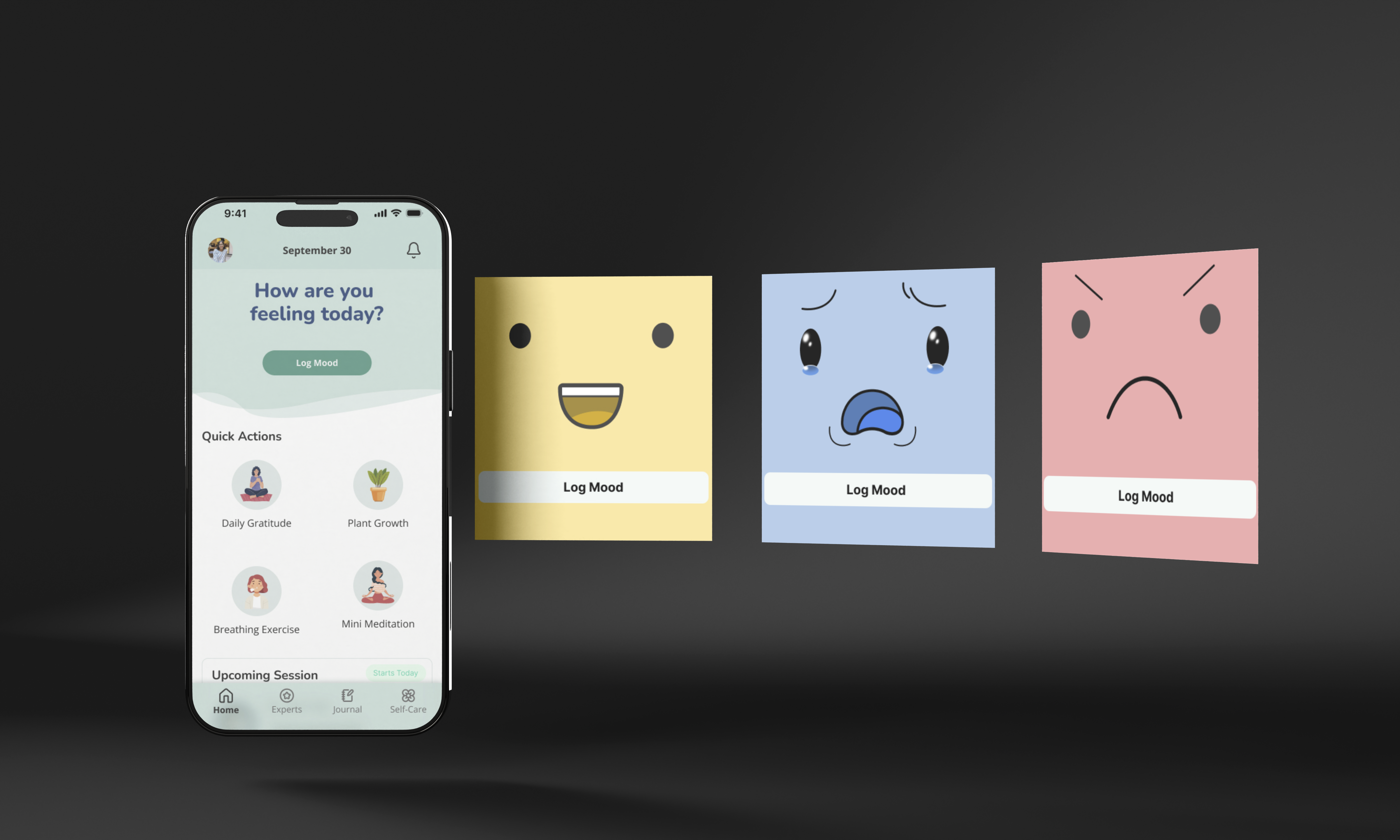
Rather than relying on numbers or lengthy questionnaires, the Mood Log uses expressive visuals to help users identify and record their emotions in seconds. The playful illustrations reduce the pressure of self-assessment, making daily check-ins feel approachable and encouraging long-term consistency. Over time, these small reflections create a meaningful emotional history, helping users recognize patterns, understand their well-being, and develop greater self-awareness.
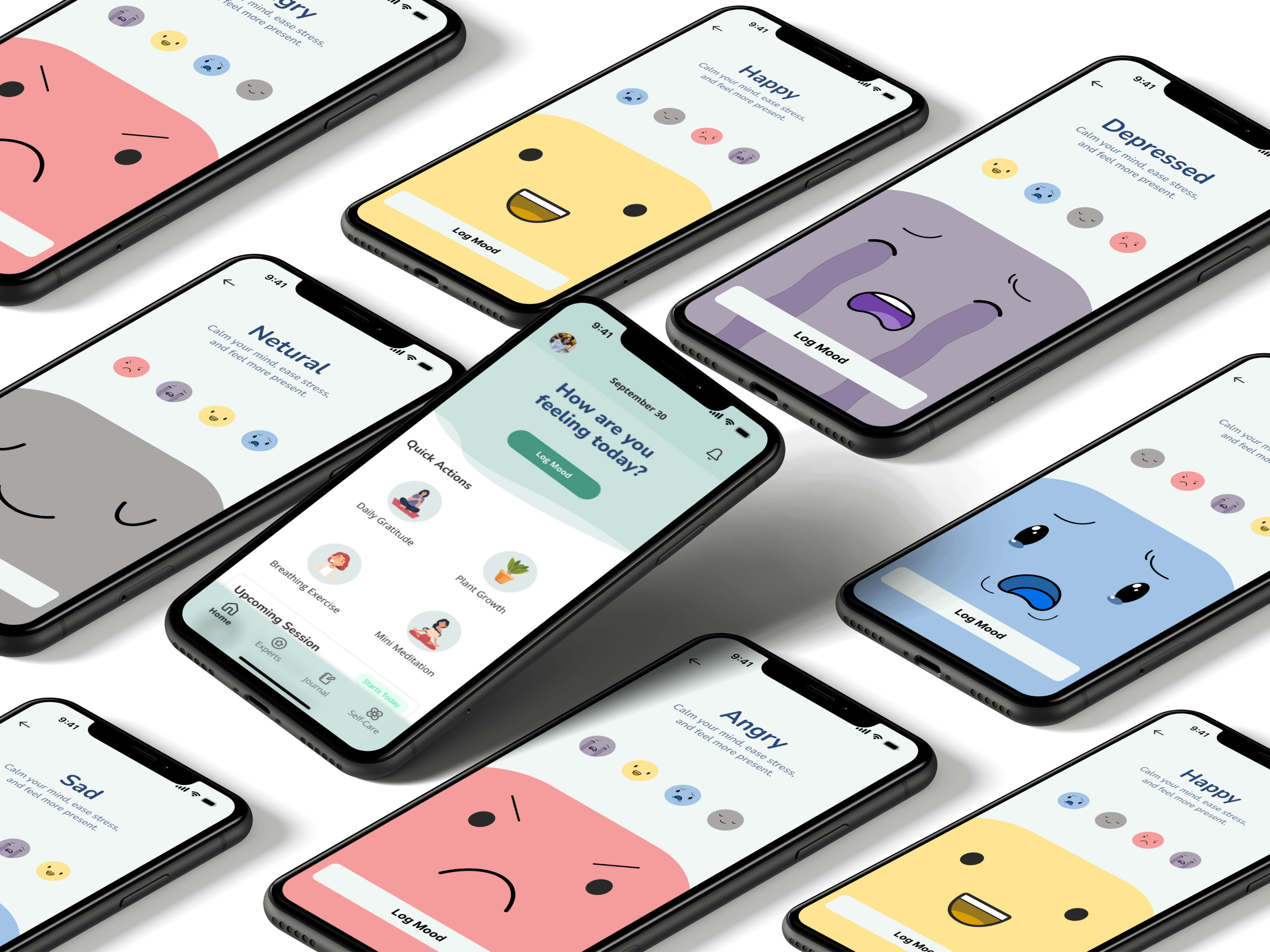
A thoughtfully designed set of tools that support self-awareness, emotional wellbeing, and everyday mental health.
 Mood
Mood Breathing
 Mindful
 Daily
Daily Community
 Sleep
Sleep Guided
 Therapy
 Progress
 Emotional
 Daily Gratitude
 Bloom Journey
 Mind Break
 Mini Meditation
Rather than encouraging endless streaks, Daily Gratitude transforms small moments of reflection into a flower that gradually blooms. The interaction makes consistency visible, making progress feel rewarding instead of pressuring. This aligns with Bloom's core philosophy: growth happens one small step at a time.
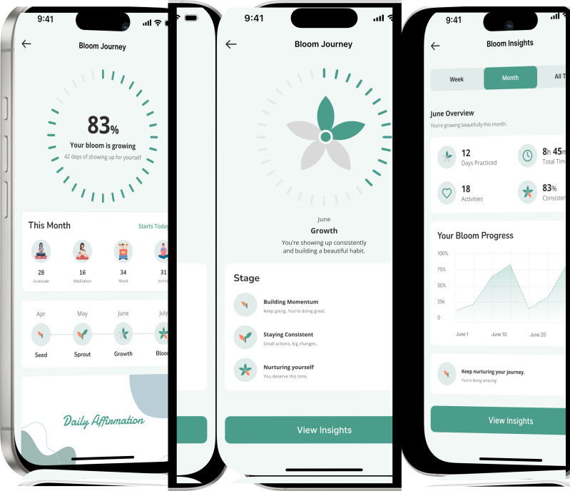
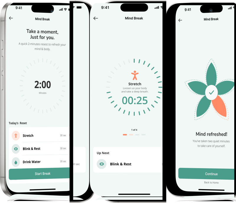
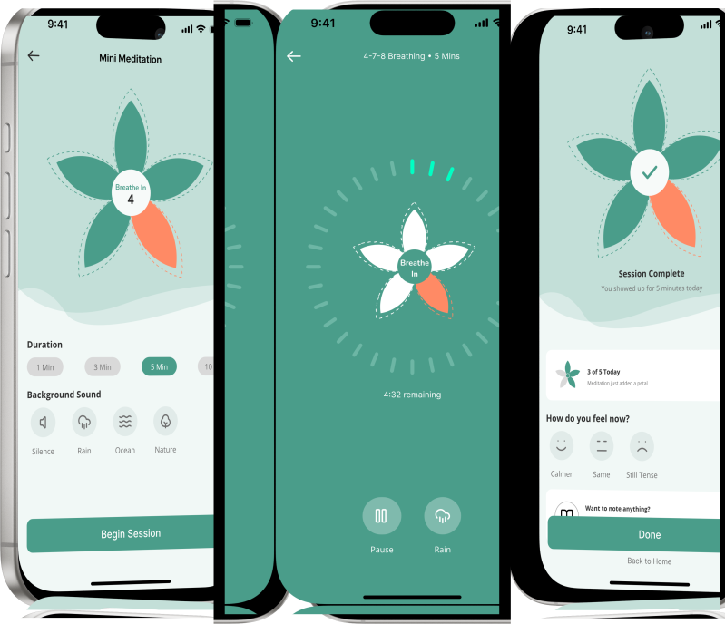
There comes a moment when life feels louder than your thoughts. Bloom was designed to create a space where the noise softens, emotions are acknowledged, and healing begins at your own pace. Through mindful moments, guided support, and small daily rituals, users are encouraged to reconnect with themselves because meaningful growth starts with a single pause.



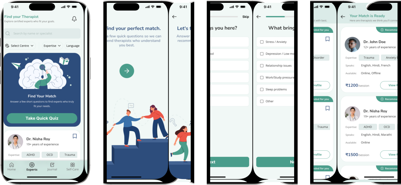
What started as an assigned brief turned into a full mental wellness product logo, colour system, onboarding, mood tracking, therapist matching all shaped by the interviews and the conversation at Agatsu Center that came before any of it. The goal from the first conversation to the last screen stayed the same: make support feel like something you'd actually want to open again tomorrow.